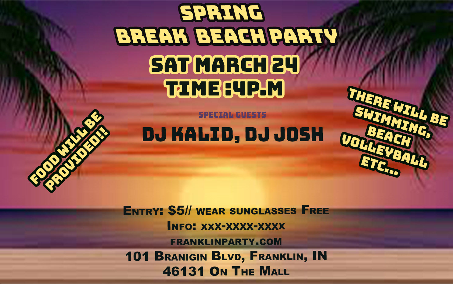
I made this flyer for my publication design class. I included this Spring Break Beach Party flyer in my portfolio because it reflects my developing design skills and my growth in understanding effective communication and audience engagement through visual media. This piece stands as a strong representation of how I’ve progressed in combining both creative and strategic elements in a single project.
The assignment was to create an informational flyer; I chose to create a spring break flyer dedicated to a goodbye spring break party. The flyer was created in Adobe Photoshop and InDesign; I wanted this flyer to immediately evoke the feeling of a fun, energetic, and vibrant event. The choice of a sunset beach background was deliberate; it sets a tone of relaxation and warmth, which are synonymous with spring break.
I paired this imagery with bold, attention-grabbing fonts in bright yellow and black to ensure legibility against the colorful backdrop. The use of drop shadows and outlines helps the text stand out while maintaining a playful aesthetic. I showcased how to create a flyer from scratch. I also thought about the importance of information. The title and date/time are most prominent since they are the key details people scan for first. Then I added high-energy callouts like “FOOD WILL BE PROVIDED!!” and “SWIMMING, BEACH VOLLEYBALL, ETC…” in dynamic, rotated text boxes to draw attention and spark interest.
These design decisions were based on my creative mindset about how event flyers are most effectively structured to catch people’s eyes and communicate quickly. I also learned how to manage spacing, color balance, and alignment in a visually busy environment, making sure no element overshadowed another. This flyer shows my ability to plan, execute, and deliver a design that is both visually appealing and functional, a skill essential in public relations, marketing, and event promotion.
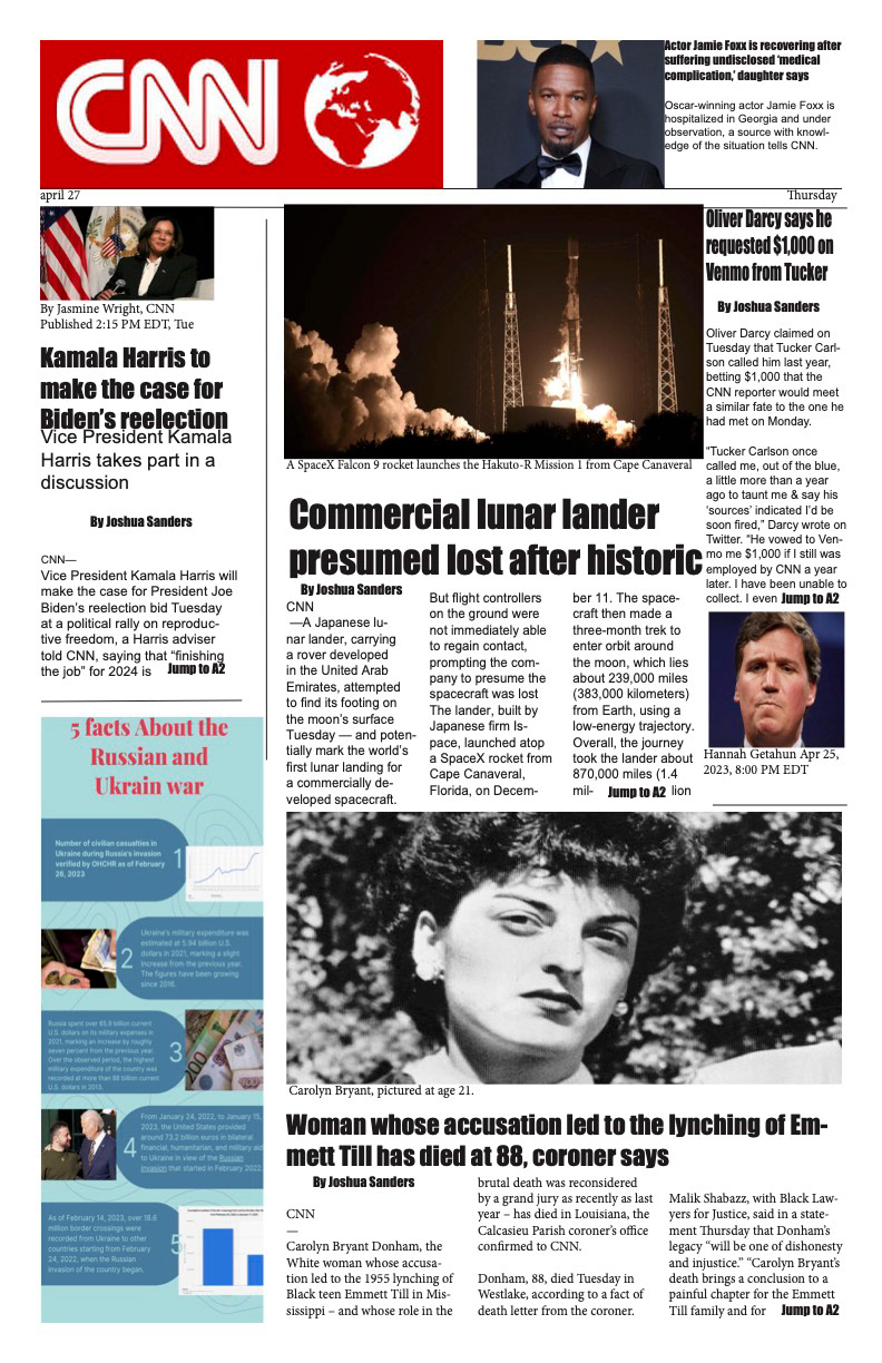
This is a news website page that I recreated from CNN stories it was for a class project where I used Adobe Photoshop, InDesign, and Canva. I put this together with a strong focus on layout, making sure there was enough white space so the content wasn’t crowded or overwhelming. This project helped me sharpen my editorial design skills and deepen my understanding of how professional media outlets structure their content. I had to source relevant and timely stories and organize them visually so that I mimicked the tone and structure of a credible news platform. Working on this layout pushed me to think critically about balance and spacing. I arranged text blocks, images, and headers in a newspaper format, which challenged me to create a sense of order while maintaining reader engagement.
Being a first time user of InDesign, I was truly challenged on how to use the suite and understand the ins and outs of InDesign layouts. It taught me how to make smart, creative choices about how to structure and present information compellingly. Mimicking CNN’s visual tone pushed me to think critically about branding, alignment, and spacing elements that are essential in any media or news setting.
Additionally, this assignment helped me better understand how visual hierarchy can guide a reader’s experience, from headline to caption. It taught me how to manage multiple pieces of information without overwhelming the audience. This layout is a great example of how I’ve grown to understand the power of visual storytelling. I’m proud to include this in my portfolio because it reflects my ability to design within professional constraints, using real-world content to build something visually powerful. It shows that I can translate raw information into a polished, media-ready product using tools like InDesign and Photoshop. This was all about creativity, design thinking, and showing I understand the aesthetics of modern news presentation skills that are essential in today’s fast-moving media landscape.